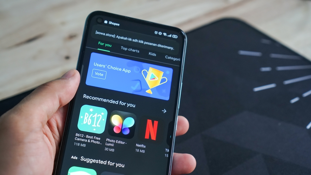
While the Play Store Android app has undergone many design changes over the years, the app store site has remained largely unchanged. It used the early Material Design precepts for years, but that is finally changing. Google is currently testing a new design for the Play Store website, says AppTractor.

The new design appears to only work in a handful of regions so far, such as Korea and Taiwan, and depends on the user account. Content is more stretched rather than anchored inside a horizontally centered box. The page background is now white, icons are enlarged, and some app pages (like Netflix) have large header images that stretch across the top of the screen.
The sidebar is now only shown when clicking on your profile picture in the upper right corner. There are also a few minor functional improvements over the previous design. A scroll bar has finally appeared in the screenshot gallery on the app pages, so you can see everything without using the left and right arrows, notes NIX Solutions. The main Apps and Games pages now have buttons at the top to quickly filter apps for phones, tablets, TVs, Chromebooks, Wear OS, and cars.
